 With free tools like Google Earth and mapbuilder so widely available, these days it seems that everyone’s a mapmaker.
But mapping data to location in an effort to reveal previously unseen connections—now that’s a taller order. (To introduce learners to the concept, howtosmile.org’s data mapping activities are a good place to start.)
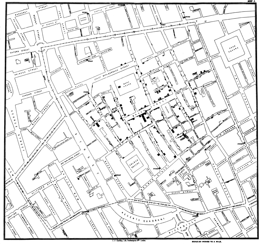
An excellent example of the power of maps comes from 19th century London, when Dr. John Snow disproved the belief that cholera was spread via “bad air” by analyzing data on the location of infections and the location of water wells.
When he created his famous map during the cholera outbreak of 1854, Snow was already a practicing scientist and a medical doctor known for refining the dosage of anesthesia for surgery patients; he personally administered chloroform to Queen Victoria when she gave birth to the last two of her nine children.

Snow was skeptical of the then-dominant miasma theory, which held that diseases such as cholera and the Black Death were caused by pollution or "bad air." Snow wasn’t sure what was causing the cholera outbreak, but by talking to local residents he discovered that most of the deaths had taken place near one particular pump, which drew water from a public well that had been dug only three feet from an old cesspit.
By plotting his data on a street map of London, Snow convincingly showed that outbreaks were clustered around this particular well. The map also underscored the idea that cholera was caused by bacteria rather than bad air, and convinced authorities to close down the offending pump.
Image above: the original map by John Snow, showing the clusters of cholera cases in the London epidemic of 1854
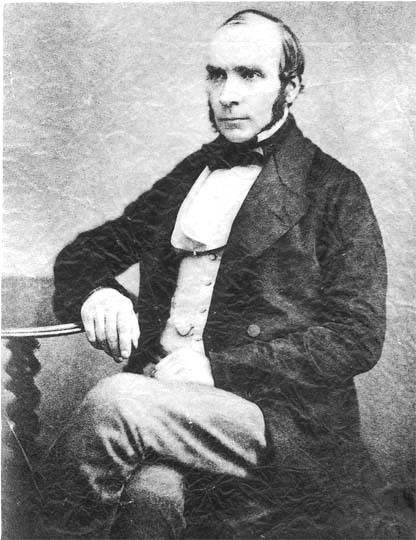
Image to the right: Dr. John Snow
