Ever wonder where all that spam clogging your inbox comes from? If someone were to answer your idle speculation with a list of originating IP addresses, would you sit down with a cup of hot cocoa and study that document?
Probably not. But if you saw a spam map of the same information—with a surprising concentration in Brazil, Poland, and Vietnam (as one mapmaker found)—you might dig deeper.
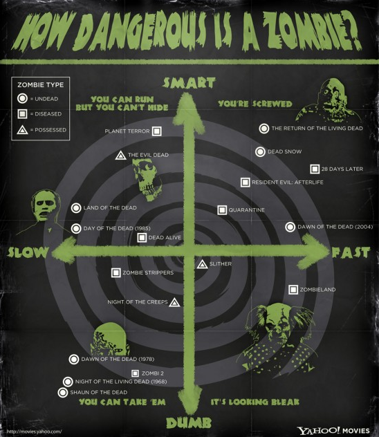
It’s not news that the way data is presented affects our ability and desire to engage with information. Even if you shy away from statistics, you might be interested in seeing San Francisco crime mapped as elevation or a handy zombie survival chart.
These examples are highlighted at FlowingData, a Web site that explores how designers, statisticians, and computer scientists are using data to understand ourselves better--mainly through data visualization.
<<Howtosmile.org has hundreds of hands-on activities that touch on the relationship between data and how it’s presented.>>
Another example of creative data visualization, right in time for Geography Awareness Week (Nov 14 – 20), is Science on a Sphere (SOS). It’s a room-sized projection that uses computers and video to display animated data onto the outside of a sphere. It can be programmed to display anything from where volcanoes have erupted in the past century to projections of what would happen if the polar ice cap melted.
You can visit SOS at UC Berkeley’s Lawrence Hall of Science, and there are 50 more worldwide, including spheres in China, France, and Mexico. It's well worth seeking one out.
